I redesigned my personal website last year. Spent weeks getting the typography right, choosing a color palette that worked beautifully in both light and dark modes, and making sure every button, card, and navigation element looked polished in both themes. Then I added the first image — a screenshot with a white background — and watched it blow out the entire dark mode experience like a flashbang in a dim room. The content was gorgeous. The image was an eyesore.
This is the dark mode image problem, and in 2026, it's more relevant than ever. Over 80 percent of smartphone users have dark mode enabled on their devices. Major operating systems (iOS, Android, Windows, macOS) all offer system-wide dark mode. And an increasing number of websites — including some of the biggest names on the internet — are implementing dark themes as a default or primary option. If your images don't adapt to dark mode, they're actively degrading your users' experience.
This guide covers everything you need to know about optimizing images for dark mode: the types of images that cause problems, practical techniques for making them work across both themes, CSS strategies for automatic adaptation, and a complete workflow for creating dark-mode-ready visual assets.
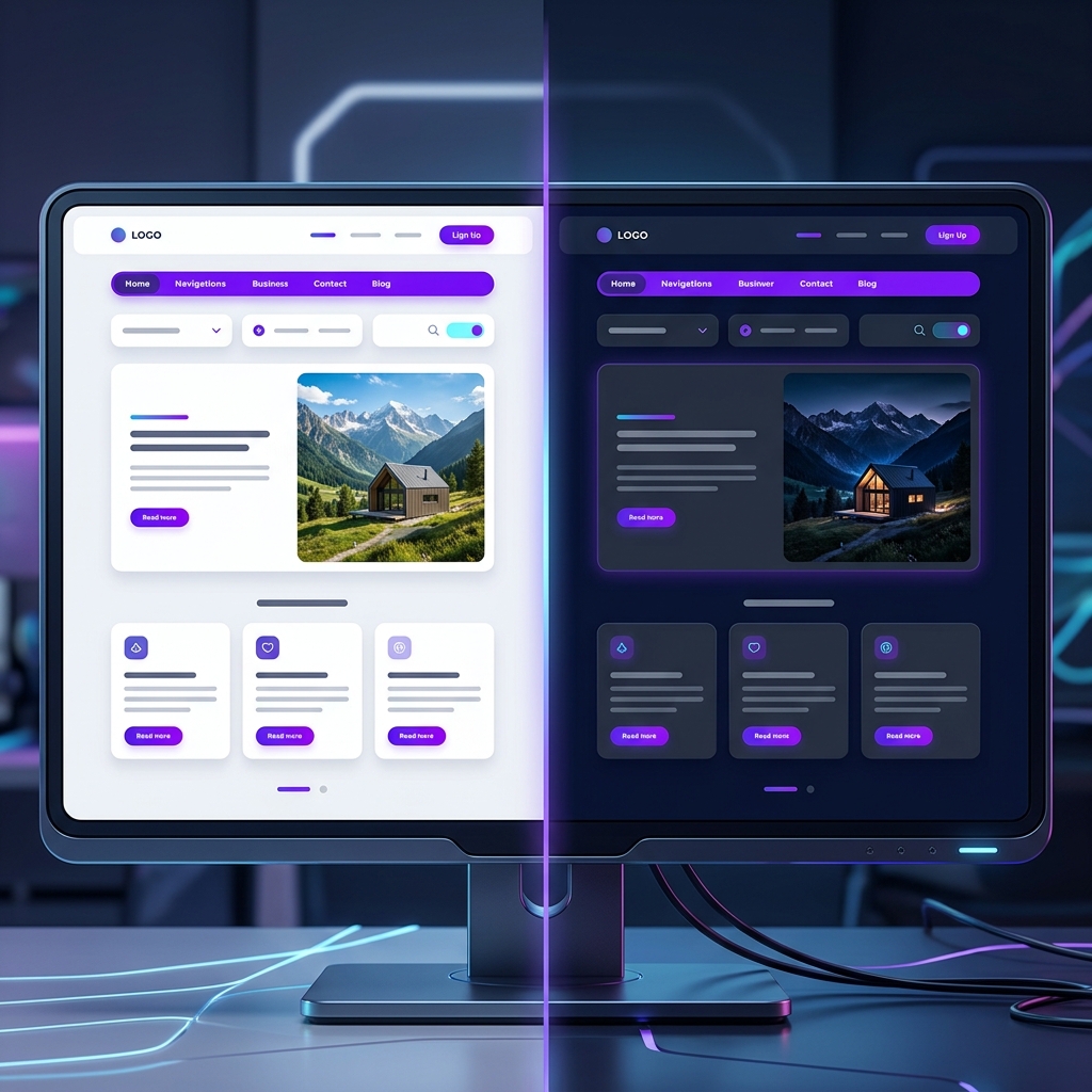
Why Images Break in Dark Mode
To understand the problem, you need to think about what dark mode actually changes. In light mode, the page background is typically white or near-white (#ffffff or similar), and text is dark. In dark mode, that relationship inverts — the background becomes dark (#1a1a2e, #121212, etc.) and text becomes light.
Photographs generally look fine in both modes. A photo of a sunset or a portrait has its own internal lighting and color balance that doesn't depend on the surrounding page background. But non-photographic images — screenshots, diagrams, logos, illustrations, charts, and UI elements — often have assumptions about the background color baked into them.
The most common offenders:
- Screenshots with white backgrounds: A screenshot of a website or application that was captured in light mode creates a harsh, blinding white rectangle on a dark page.
- Logos with white/light backgrounds: A logo saved as JPEG (without transparency) appears as a white rectangle on a dark background. Even logos saved as transparent PNGs can look wrong if they use dark text that becomes invisible on a dark background.
- Diagrams and charts: Flowcharts, org charts, and data visualizations designed with white backgrounds and dark text become jarring in dark mode.
- Icons: Black or dark-colored icons designed for light backgrounds become invisible on dark backgrounds.
- Illustrations with assumed backgrounds: Illustrations where the artist assumed a white canvas — leaving areas uncolored that are "supposed" to be white — end up with transparent holes showing the dark background through them.
Strategy 1: Use Transparent PNGs with Light and Dark Variants
The most robust approach for logos, icons, and simple graphics is to create two versions: one optimized for light backgrounds and one for dark backgrounds. Then use CSS to swap between them based on the active theme.
For example, your company logo might use dark navy text on transparent background (for light mode) and white text on transparent background (for dark mode). You'd implement this in HTML and CSS like so:
<picture>
  <source srcset="logo-dark-mode.png" media="(prefers-color-scheme: dark)">
  <img src="logo-light-mode.png" alt="Company Logo">
</picture>
This uses the <picture> element with the prefers-color-scheme media query to automatically serve the appropriate version. Users in light mode see the dark logo; users in dark mode see the light logo. No JavaScript required — it's handled entirely by the browser.
The key to making this work is having your logos and icons saved as transparent PNGs. If your logo currently has a white background baked in, you'll need to remove it first using a background removal tool.
Strategy 2: CSS Brightness and Filter Adjustments
If creating separate image variants isn't practical — say you have a blog with hundreds of embedded images and can't create dark-mode versions of all of them — you can use CSS filters to automatically adjust images when dark mode is active.
The simplest approach:
@media (prefers-color-scheme: dark) {
  img:not(.no-dark-adjust) {
    filter: brightness(0.85) contrast(1.1);
  }
}
This slightly reduces brightness and increases contrast for all images in dark mode, which prevents that "flashbang" effect of a bright image on a dark page. The adjustment is subtle enough that photographs still look natural, but it takes the edge off images that are predominantly white or bright.
For screenshots and diagrams specifically, you can go more aggressive with an inversion filter:
@media (prefers-color-scheme: dark) {
  .invertible-image {
    filter: invert(1) hue-rotate(180deg);
  }
}
The invert(1) flips all colors — white becomes black, black becomes white. The hue-rotate(180deg) then corrects the color shift that inversion introduces, bringing hues back to approximately their original values. The result is a dark-background version of the image that preserves the original color relationships. This works remarkably well for screenshots, diagrams, charts, and any image that's primarily black content on a white background.
The CSS filter approach is a pragmatic solution for existing content. It won't produce pixel-perfect results, but it dramatically improves the dark mode experience for 90% of problematic images with zero manual image editing.
Strategy 3: Add Subtle Borders or Shadows
Sometimes the problem isn't the image content itself but the transition between the image and the dark background. A photograph or screenshot with a very light border area can appear to "float" on a dark page with no clear boundaries. Adding a subtle border or shadow creates visual separation:
@media (prefers-color-scheme: dark) {
  .blog-content img {
    border: 1px solid rgba(255, 255, 255, 0.1);
    box-shadow: 0 4px 20px rgba(0, 0, 0, 0.4);
  }
}
This adds a barely-visible light border and a deeper shadow that defines the image boundary against the dark background. It's a subtle touch, but it makes a noticeable difference in how polished the dark mode feels.
Strategy 4: Use SVGs for Scalable Graphics
For logos, icons, diagrams, and any vector-based graphics, SVG is the ideal format for dark mode compatibility. Unlike raster images (PNG, JPEG, WebP), SVG elements can be styled with CSS — including responding to dark mode preferences.
<svg class="icon" viewBox="0 0 24 24">
  <path d="M12 2L2 12h3v8h6v-6h2v6h6v-8h3L12 2z"/>
</svg>

<style>
  .icon path {
    fill: #333333;
  }
  @media (prefers-color-scheme: dark) {
    .icon path {
      fill: #e0e0e0;
    }
  }
</style>
This approach gives you complete control over every element of the graphic in both modes. Colors, stroke widths, opacities — everything is adjustable via CSS. For websites with a significant number of icons and simple graphics, converting from raster PNGs to SVGs is one of the highest-impact improvements you can make for dark mode.
Handling Photographs in Dark Mode
Photographs are the easiest category to handle because they generally look fine in both modes. The main concern is preventing bright photographs from being visually overwhelming on a dark page. Here are the best practices:
- Reduce brightness by 10-15%: A subtle CSS brightness filter prevents bright photos from dominating the page in dark mode without making them look unnaturally dim.
- Add rounded corners and shadows: Giving photos rounded corners and soft shadows helps them integrate with the dark page design rather than appearing as harsh rectangles.
- Consider dark vignettes: For hero images and full-width banners, a subtle dark gradient overlay at the edges creates a smooth transition between the photo and the dark background.
- Use image optimization: Dark mode users are often on mobile devices at night (that's when dark mode matters most). Optimized, compressed images load faster on mobile networks. Use our Image Compressor to keep files lean.
A Complete Dark Mode Image Checklist
Here's my practical checklist that I run through whenever I'm building or auditing a website for dark mode:
- Audit all images: Switch your site to dark mode and scroll through every page. Flag any image that looks jarring, too bright, or has edge contrast issues.
- Replace JPEG logos with transparent PNGs: Remove white backgrounds from logos and save as transparent PNG. Create light and dark variants. Use our Background Remover for the heavy lifting.
- Convert icons to SVG: Wherever possible, replace raster icons with SVGs that can be colored via CSS.
- Add global CSS brightness filter: Apply a subtle brightness reduction (0.85-0.90) to all images in dark mode as a safety net.
- Use border/shadow for definition: Add subtle borders and enhanced shadows to images in dark mode.
- Create invertible class for diagrams: Add the invert + hue-rotate filter to screenshots, charts, and diagrams.
- Test on actual devices: Dark mode looks different on different screens. Test on a phone in a dark room — that's where most dark mode users will be.
- Optimize file sizes: Compress all images. Mobile dark mode users are often on cellular connections. Every kilobyte matters.
The Future: Automatic Dark Mode for Images
The web standards community is actively working on better native support for theme-adaptive images. The CSS Color Level 5 specification introduces the light-dark() function, which simplifies theme-responsive styling. Future CSS specifications may include native image adaptation features that handle brightness and contrast adjustments automatically based on the surrounding context.
For now, the techniques in this guide represent the current best practices. They're battle-tested, widely supported, and will continue to work as standards evolve. The key takeaway is simple: dark mode isn't optional anymore. It's a mainstream user expectation. And images that don't adapt to dark mode are a design failure that's as visible and jarring as a broken layout or an unreadable font. The fix is well within your reach — a few CSS rules, a handful of transparent PNGs, and a bit of thoughtful planning can transform your dark mode from an afterthought into a genuinely premium experience.
Make Your Images Dark Mode Ready
Remove backgrounds, convert formats, and optimize images for both light and dark themes using our free tools.
Explore All Image Tools →