I once audited a food blog that served a single 4000×3000 pixel hero image to every visitor regardless of their device. A user on a 375-pixel-wide iPhone was downloading a 4.2 MB image that their browser then downscaled to fit a space roughly 375 pixels wide. That's like shipping a dining table through the mail when someone ordered a coaster. The bandwidth waste was absurd, the page load was painful, and the Core Web Vitals scores were catastrophic.
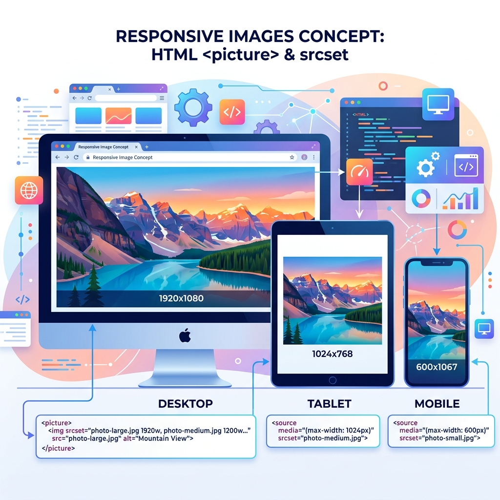
Responsive images solve this problem by serving different image files to different devices based on screen size, pixel density, and supported formats. A phone gets a 400-pixel-wide JPEG. A tablet gets an 800-pixel version. A desktop with a Retina display gets a 1600-pixel version. The visual result is identical — a sharp, properly sized image — but the file size delivered to each device is dramatically different.
The Problem with Single-Image Approaches
When you use a single <img> tag with one source file, every device downloads that exact file. If you optimize for desktop (large image), mobile users download unnecessarily large files. If you optimize for mobile (small image), desktop users see a blurry, upscaled image. There's no winning with a single source.
The numbers are stark. A 1200-pixel-wide JPEG at 80% quality might be 180 KB. A 400-pixel version of the same image at the same quality is typically 25-35 KB. Serving the smaller version to mobile users saves 145+ KB per image. On a page with 20 images, that's nearly 3 MB saved — the difference between a fast-loading mobile page and a frustrating one.
srcset: Resolution Switching
The srcset attribute provides the browser with multiple image sources at different widths or pixel densities, letting the browser choose the most appropriate one:
<img
  src="hero-800.jpg"
  srcset="hero-400.jpg 400w,
          hero-800.jpg 800w,
          hero-1200.jpg 1200w,
          hero-1600.jpg 1600w"
  sizes="(max-width: 600px) 100vw,
         (max-width: 1200px) 50vw,
         800px"
  alt="Restaurant interior with warm lighting"
>
The srcset attribute lists available image files and their widths (400w, 800w, etc.). The sizes attribute tells the browser how wide the image will be displayed at different viewport sizes. The browser combines these two pieces of information to select the optimal file.
How the Browser Decides
When the browser encounters this markup, it calculates: "At the current viewport width, how many pixels wide will this image be rendered?" If the viewport is 375 pixels (mobile phone) and the sizes attribute says 100vw at that breakpoint, the image will be 375 CSS pixels. On a 2× Retina display, the browser needs 750 physical pixels to render it sharply. It selects hero-800.jpg (the closest file that's at least 750 pixels wide).
On a 1440-pixel desktop where the image renders at 800 CSS pixels with a 1× display, the browser selects hero-800.jpg. Same desktop with a 2× display: it selects hero-1600.jpg. The browser handles all the math — you just provide the options.
The Picture Element: Art Direction
The <picture> element goes beyond resolution switching. It allows completely different images at different breakpoints — different crops, different compositions, or different formats:
<picture>
  <source media="(max-width: 600px)"
          srcset="hero-mobile-crop.webp" type="image/webp">
  <source media="(max-width: 600px)"
          srcset="hero-mobile-crop.jpg">
  <source srcset="hero-desktop.webp" type="image/webp">
  <img src="hero-desktop.jpg"
       alt="Restaurant interior with warm lighting">
</picture>
This markup serves a tightly cropped mobile-optimized image to phones and a wide panoramic version to desktops. It also serves WebP to browsers that support it and falls back to JPEG for older browsers. The <img> tag at the end is the mandatory fallback — every <picture> element must contain an <img> tag.
Format Negotiation with Picture
One of the most powerful uses of <picture> is serving modern image formats with automatic fallback:
<picture>
  <source srcset="photo.avif" type="image/avif">
  <source srcset="photo.webp" type="image/webp">
  <img src="photo.jpg" alt="Product photo">
</picture>
Browsers that support AVIF get the smallest file. Browsers that support WebP but not AVIF get the middle option. Everything else gets the universally supported JPEG. This progressive enhancement pattern is the current best practice for image format delivery.
Generating Responsive Image Variants
You need multiple sizes of every image. Creating them manually is tedious. Here are the practical approaches:
- Build tools (recommended): Use image processing libraries like Sharp (Node.js), Pillow (Python), or ImageMagick (CLI) to automatically generate size variants during your build process. Most static site generators and frameworks (Next.js, Gatsby, Astro, Hugo) have built-in image optimization plugins.
- CDN-based resizing: Services like Cloudflare Images, Imgix, and Cloudinary resize images on-the-fly via URL parameters. Upload one high-resolution original, and the CDN generates and caches every size variant automatically.
- Manual resizing: For small sites, use our Image Resizer to create 3-4 size variants of each important image.
A practical set of widths for most websites: 400px, 800px, 1200px, and 1600px. These four variants cover mobile phones, tablets, standard desktops, and Retina desktops. You rarely need more granularity than this.
Common Responsive Image Mistakes
- Missing the sizes attribute: Without
sizes, the browser assumes the image is 100vw (full viewport width) and downloads larger files than necessary for images that are smaller than full width. - Not including a fallback: The
<img>element inside<picture>is required. Without it, the image breaks in any browser that doesn't support the<picture>element. - Generating too many variants: 15 size variants per image creates storage and build-time overhead with minimal benefit. Four to five variants is the sweet spot for most sites.
- Ignoring art direction: Serving a scaled-down landscape panorama to mobile often results in an image where the subject is too small to see. Sometimes mobile needs a different crop, not just a smaller version of the same crop.
Create Responsive Image Variants
Use our free Image Resizer to generate multiple size variants of your images for responsive delivery.
Resize Images Free →