A client's e-commerce website had 48 product images on their category page. Every time a visitor loaded that page, their browser downloaded all 48 images simultaneously — about 12 MB of data — before the page became interactive. On a fast connection, the page took 4.3 seconds to fully load. On mobile 4G, it took over 11 seconds. Their bounce rate was 67 percent, and Google's PageSpeed Insights scored the page 23 out of 100.
I added two words to their image tags. Two words. loading="lazy". The initial page load dropped to 1.8 seconds because the browser now only downloaded the 6 images visible in the viewport. The remaining 42 images loaded on-demand as the user scrolled down. PageSpeed score jumped to 74. Bounce rate dropped to 41 percent over the following month. Two words. That's what lazy loading does.
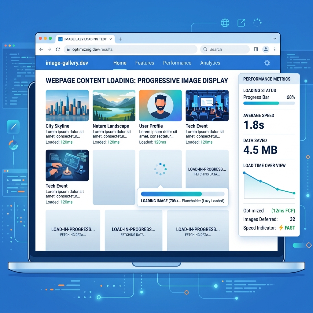
What Is Lazy Loading?
Lazy loading is a technique where images (and other resources) are not loaded until they're actually needed — typically when they're about to enter the browser's viewport as the user scrolls. Instead of downloading every image on the page at once, the browser downloads only the images that are currently visible, then progressively loads additional images as the user scrolls toward them.
Without lazy loading, a page with 50 images forces the browser to download all 50 images the moment the page is requested, regardless of whether the user will ever scroll down to see them. This wastes bandwidth, slows down the initial page render, and delays interactivity. With lazy loading, only the first few visible images are downloaded initially, and the rest are fetched on-demand.
Native HTML Lazy Loading (The Easy Way)
Modern browsers support native lazy loading through a single HTML attribute. No JavaScript required, no libraries to install, no configuration to manage:
<img src="product-photo.jpg" alt="Red leather wallet" loading="lazy" width="800" height="600">
That's it. The loading="lazy" attribute tells the browser to defer loading this image until the user scrolls near it. Browser support is excellent: Chrome, Firefox, Edge, Safari, and Opera all support native lazy loading as of 2024. The only notable exception is Internet Explorer, which is effectively dead.
Important: Always Set Width and Height
When using lazy loading, always specify the width and height attributes (or use CSS to set dimensions). Without explicit dimensions, the browser doesn't know how much space the image will occupy until it downloads. This causes layout shifts — content jumping around as images load — which hurts both user experience and your Cumulative Layout Shift (CLS) Core Web Vital score.
What NOT to Lazy Load
Lazy loading is not appropriate for every image on the page. Some images should load immediately:
- Above-the-fold images: The hero image, header logo, and any images visible without scrolling should use
loading="eager"(the default) or simply omit the loading attribute. Lazy loading above-the-fold images actually hurts performance because it adds unnecessary delay to content that needs to appear immediately. - LCP (Largest Contentful Paint) image: The largest visible element in the viewport is typically a hero image or banner. This image directly determines your LCP Core Web Vital score. Lazy loading your LCP image will tank your LCP metric.
- Critical UI elements: Navigation icons, brand logos, and UI images that are part of the initial page experience should load immediately.
A good rule: lazy load everything below the fold. Eagerly load everything above the fold. If you're unsure whether an image is above or below the fold, test at common viewport sizes (1920×1080 desktop, 375×667 mobile) and check.
Lazy Loading with JavaScript (For More Control)
Native lazy loading works well for simple cases, but JavaScript-based solutions offer more control over loading behavior, placeholder animations, and fallback strategies. The Intersection Observer API is the modern standard for implementing custom lazy loading:
const images = document.querySelectorAll('img[data-src]');

const observer = new IntersectionObserver((entries) => {
  entries.forEach(entry => {
    if (entry.isIntersecting) {
      const img = entry.target;
      img.src = img.dataset.src;
      img.removeAttribute('data-src');
      observer.unobserve(img);
    }
  });
}, { rootMargin: '200px' });

images.forEach(img => observer.observe(img));
This approach uses data-src instead of src for lazy images, then swaps the attribute when the image enters a 200-pixel buffer zone before the viewport. The rootMargin: '200px' setting starts loading images slightly before they become visible, preventing the user from seeing blank spaces while scrolling.
Impact on Core Web Vitals
- LCP (Largest Contentful Paint): Proper lazy loading improves LCP by reducing network contention. When fewer images compete for bandwidth during initial load, the critical above-the-fold images load faster. But lazy loading the LCP image itself will worsen this metric.
- FID/INP (Interaction to Next Paint): Fewer images downloading simultaneously means less main thread work, leading to faster interactivity. The browser spends less time decoding and rendering images that aren't visible yet.
- CLS (Cumulative Layout Shift): Lazy loading without explicit image dimensions causes layout shifts. Always set width and height attributes on lazy-loaded images to reserve space in the layout before the image arrives.
Common Lazy Loading Mistakes
- Lazy loading all images including above-the-fold: The most common mistake. Measure your fold line and only lazy load images below it.
- Not providing fallback dimensions: Without width and height, lazy-loaded images cause content to jump when they load.
- Using both native and JavaScript lazy loading simultaneously: This can cause double-loading or race conditions. Pick one approach and use it consistently.
- Not compressing images before lazy loading: Lazy loading improves when images load, not how large each image is. A 5 MB lazy-loaded image still takes 5 MB to download. Compress your images first using our Image Compressor.
Lazy loading is the single highest-impact, lowest-effort optimization you can make for image-heavy websites. Two words in your HTML — loading="lazy" — and you've potentially cut your page load time in half. Combine it with proper image compression, modern formats like WebP, and responsive images via srcset, and you have a performance-optimized image strategy that rivals anything a dedicated performance consultant would implement.
Compress Before You Lazy Load
Lazy loading controls when images load — compression controls how much they weigh. Use both for maximum performance.
Compress Images Free →